Design systems are growing in popularity as organizations realize how greatly they empower their various teams to create accessible on-brand web and mobile apps while avoiding duplicated work. However, they often encounter conflicts when mapping established style architecture patterns onto the new abstractions inherent in a design system. In this article I want to talk about a common problem: context and naming around shared variables.
On one hand there are design tokens, which have been used successfully by countless teams over the years to ensure that elements across their UIs are consistent. There are design tokens for fonts, colors, sizes, spaces, and even indivisible pieces of an interface. Designers want every part of the app interface and all the elements to have the same look and feel, and design tokens were created to help them achieve that outcome.
On the other hand, design systems emerged to facilitate easier development with premade components while ensuring that style remains consistent. The team employs them to reuse elements and functionality across the app. Components include branded date-pickers, buttons, modals, and other functional elements of an interface. They too can be used across different sections of an app, but their implementation is oriented locally: the styles and logic are written as if the component is an independent element.
Reuniting these two worlds can be conflicting: how do you name design tokens semantically if they have to make sense everywhere but also respond to the inner logic of individual components which are independently developed? In this article, we'll explore the problem and how BEM—a well-known naming design pattern—can come to the rescue.
The crux of the matter illustrated
Let's say we are defining design tokens for colors. We give them semantic names to reflect the meaning of each color:
$dt-primary: #f74d7b;
$dt-disabled:  #767677;
$dt-inverse: #FFFFFF;
$dt-lines: #404041;
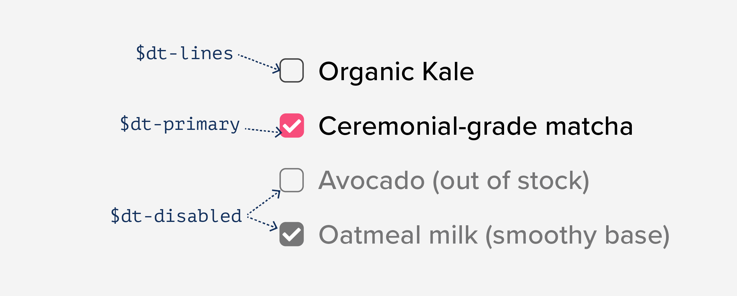
When building components, we could use these tokens to define colors for the component elements. In the case of a checkbox, the chosen names work very well.
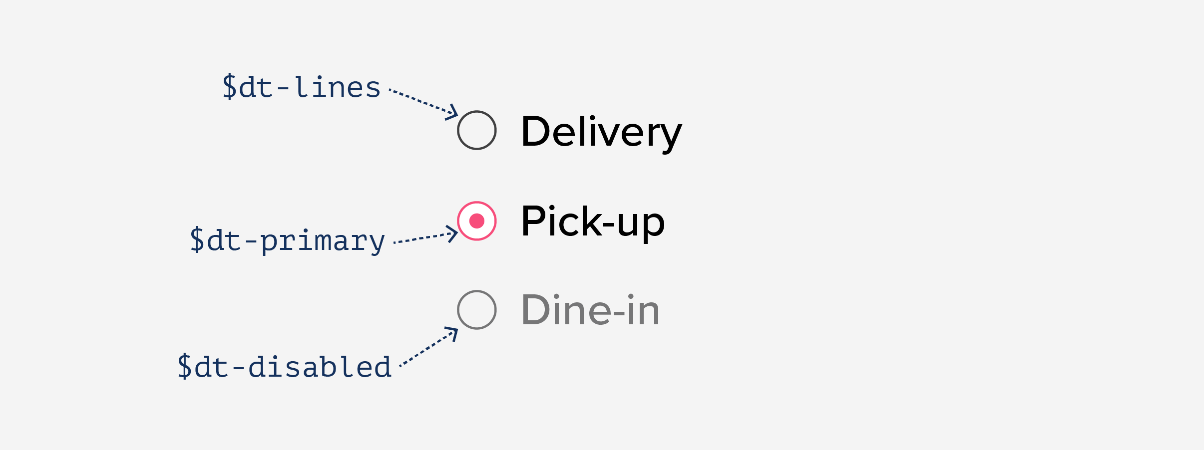
For a component of similar semantic meaning, we can use the same names. You can see below how the design tokens translate to the scope of a radio button:
However, when it comes to a different component, the same names may not reflect the purpose of the color even though the color palette stays the same. Let's have a closer look at a hypothetical progress bar where we re-use the colors we had available:
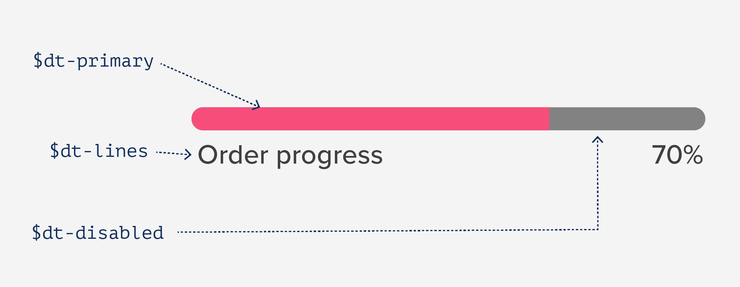
The "primary" color works well for the progress content color. But the label text uses "lines" and the bar’s background is “disabled." These names are confusing and make the component styles fragile. We’d be in trouble if, say in a later iteration, the color of the lines is changed to a very light gray, making the progress bar label hard to read as an unintended side-effect.
It would make sense to keep color-like names for the tokens, because then they easily translate to any component. But how semantic are such names?
Meet me at the middle layer
With design tokens we are trying to create a global context for the whole interface we are building, including future not-yet-known components. No matter how thoroughly we try to anticipate all the different twists and turns app development might take, we will never cover all future bases. It may seem that we nailed it on the first iteration, but sooner or later new components will come and shatter our pristine global token names – that is unless we introduce a middle-layer between the universal design token and the variables used within the context of a component.
Middle layers are common practice in software engineering when we have to match two abstractions. In this case, we introduce local design tokens that make sense at the component context level but which receive their data from universal design tokens.
Let's transform our previous example into a middle layer approach. Doing so requires us to think differently about the semantics we provide to our tokens. In this iteration, let's define our global design tokens as follows:
$dt-color__neutral--900: #000000;
$dt-color__neutral--700: #404041;
$ds-color__neutral--400: #767677;
$dt-color__neutral--100: #FFFFFF;
$dt-color__neutral: $dt-color__neutral--900;

$dt-color__primary: #f74d7b;

$ds-color__transparent: transparent;
Notice that now instead of being prescriptive about the purpose of each color, the semantics of the variable names lean on describing the color. For instance, instead of the name $dt-disabled we use $dt-color__neutral--700.
Within a component we will not use the global design tokens directly as we did before. Rather, we'll define new component-scoped variables to serve as a middle layer. It's only at this point that we associate functionality to our design tokens:
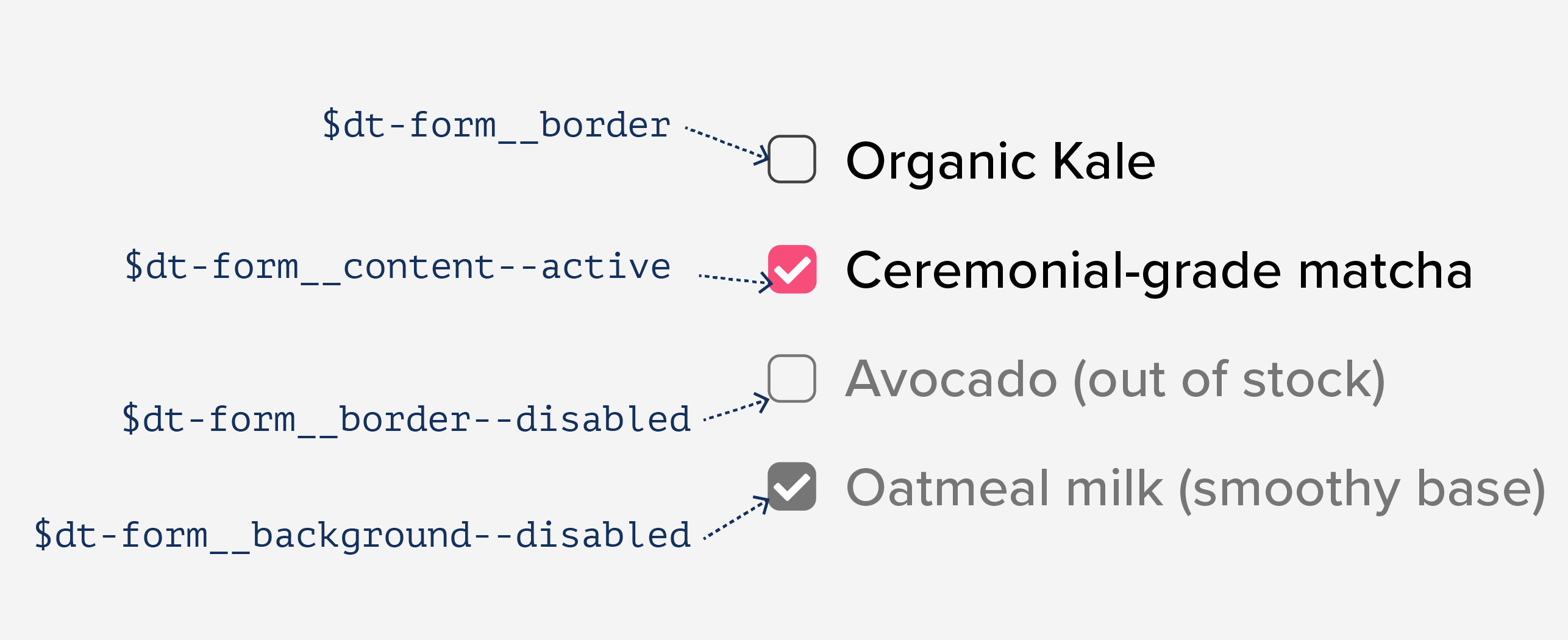
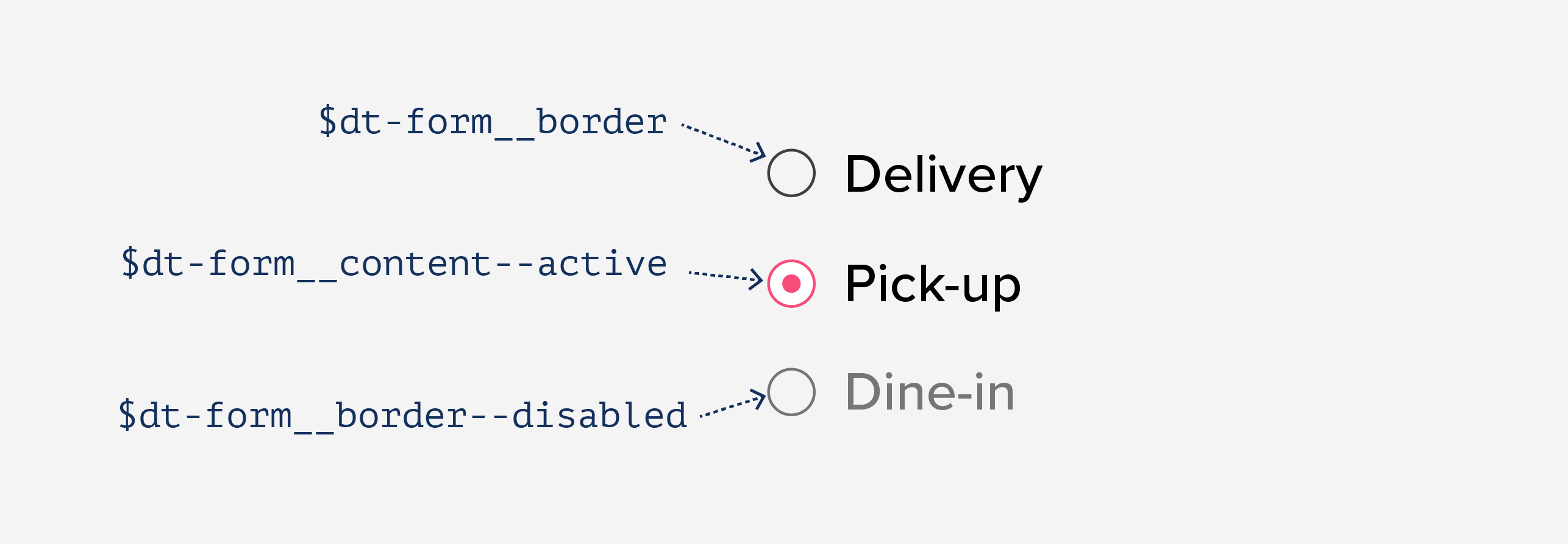
$dt-form__border: $dt-color__neutral--700;
$dt-form__border--disabled: $ds-color__neutral--400;

$dt-form__content--active: $dt-color__neutral--100;

$dt-form__background: $dt-color__transparent;
$dt-form__background--disabled: $ds-color__neutral--400;
Using the middle layer approach we employ these variables in the checkbox component instead of referencing the universal design tokens directly:
And because radio buttons and check buttons share the same semantics for colors, we can reuse those names for both components:
Best of all, we don't have the problem of conflicting names for the progress bar. Instead, we can define a local design tokens that make sense for the different elements of the component while still using the overall colors:
$dt-progressbar__background: $ds-color__neutral--400;
$dt-progressbar__content: $dt-color__primary;
$dt-progressbar__text: $ds-color__neutral—700;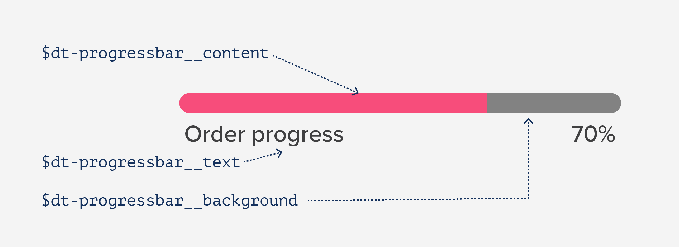
A naming old-friend: BEM
Does the naming scheme for the variables remind you of something? It should: it's Block-Element-Modifier syntax. BEM was created to help developers write consistent CSS before contextual styles were available. Technically, in these times of CSS-in-JS solutions, we have a scope per every component, so there is no need to simulate "unique" CSS classes (which was BEM's original intent). However, given its popularity, BEM can help developers create consistent variable names for design tokens without introducing new mental models.
Following BEM in choosing the names for our variables, we can define the main entities of our system (aka "blocks"): sometimes they are the components and other times semantical groups of components (like "form"). The "elements" are the parts that comprise the components, and "modifiers" are optional variants for components.
By defining the variables this way we can set up the inner structure of the component(s) we are developing, listing all their elements and modifications. Everything becomes visible, leading to what I call “conscious development.”
The same naming scheme can work for both universal design tokens and per-component variables. As we observed above, we can describe universal design tokens with BEM's conventions around semantics:
$dt-color__neutral--900: #000000;
$dt-color__neutral--700: #40404A;
$ds-color__neutral--400: #D2D2D6;
$dt-color__neutral--100: #FFFFFF;
$dt-color__neutral: $dt-color__neutral--900;

$dt-color__primary: #006AED;

$ds-color__transparent: transparent;
In this case color is the block we're describing, neutral an element of that block, and 900, 700 are variations.
In the component variables example, we describe all the inner component elements and their states. With the form case the full list will be more extensive than before:
$dt-form__border: $dt-color__neutral--700;
$dt-from__border--active: $dt-color__primary;
$dt-from__border--disabled: $ds-color__neutral--400;

$dt-form__content: $dt-color__transparent;
$dt-form__content--active: $dt-color__neutral--100;
$dt-form__content--disbaled: $ds-color__neutral--400;

$dt-form__background: $dt-color__transparent;
$dt-form__background--active: $dt-color__primary;
$dt-form__background--disabled: $ds-color__neutral--400;
Note that the same colors translate to more than one variable. Even if two styles are visually similar, sometimes they have different meanings. Having a fine-grained semantic description for the design tokens of our components helps us decouple styles from tokens, which will enable us to execute future changes more easily when the time comes for a rebranding or a new dark theme.
Middle layers work everywhere
As you may notice, the examples in this article are given in SCSS. However, it's worth to highlight that the idea of a middle layer connecting global design tokens with the scope of each independent component is conceptually technology agnostic.
For example, the same approach will work with styled-components. We'd define our universal style tokens as follows:
export const colors = {
'neutral--900': '#000000',
'neutral--700': '#40404A',
'neutral--400': '#D2D2D6',
'neutral--100': '#FFFFFF',
'neutral': '#000000',

'primary': '#006AED',

'transparent': 'transparent',
}
And implement the component-specific tokens like this:
import { colors } from './tokens.js';

const form = {
  'border': colors['neutral--700'],
  'border--active': colors['primary'],
  'border--disabled': colors['neutral--400'],

  'content': colors['transparent'],
  'content--active': colors['neutral--100'],
  'content--disbaled': colors['neutral--400'],

  'background': colors['transparent'],
  'background--active': colors['primary'],
  'background--disabled': colors['neutral--400'],
};

const StyledCheckbox = styled.div`
  // ...
  background: ${props => props.disabled ? form['background--disabled'] : form['background']};
  // …
Because we naturally have scopes with styled-components (and JavaScript in general), there is no need to follow BEM for naming any more. However, I like to still have the modifiers for the described entities named this way because it helps keep the structure flat.
Conclusion
Re-assigning design tokens to per-component variables makes it possible to define the design tokens as global entities but develop the components operating within their own semantic context. The middle layer approach pushes designers to explicitly describe the component visual architecture and that translates to its better understanding. Such a “conscious development” approach is especially helpful when the work is shared by the team.
Varya Stepanova is a design systems architect—and co-creator of BEM—based in Finland. Varya has improved the way dozens of teams, large and small, develop and evolve their design process towards better collaboration among stakeholders.
